# react-native-tag-select
**Repository Path**: TestsLing/react-native-tag-select
## Basic Information
- **Project Name**: react-native-tag-select
- **Description**: 🏷 A simple tag component to act as radio button / checkbox
- **Primary Language**: JavaScript
- **License**: Not specified
- **Default Branch**: master
- **Homepage**: None
- **GVP Project**: No
## Statistics
- **Stars**: 0
- **Forks**: 0
- **Created**: 2020-09-10
- **Last Updated**: 2020-12-19
## Categories & Tags
**Categories**: Uncategorized
**Tags**: None
## README
# react-native-tag-select
[](https://badge.fury.io/js/react-native-tag-select)
A simple tag component to act as radio button / checkbox
## Features
- Suports Array of objects or array of strings
- Support max itens selected
- Built in themes
- Plain simple and flexible API
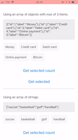
## Demo
You can try on expo: https://exp.host/@rafaelmotta021/react-native-tag-select-demo
or just check the image bellow:
## Setup
`yarn add react-native-tag-select`
or
`npm install --save react-native-tag-select`
## Usage
```javascript
import React from 'react';
import {
View,
StyleSheet,
Button,
Alert,
Text,
} from 'react-native';
import { TagSelect } from 'react-native-tag-select';
export default class App extends React.Component {
render() {
const data = [
{ id: 1, label: 'Money' },
{ id: 2, label: 'Credit card' },
{ id: 3, label: 'Debit card' },
{ id: 4, label: 'Online payment' },
{ id: 5, label: 'Bitcoin' },
];
return (
Payment: {
this.tag = tag;
}}
onMaxError={() => {
Alert.alert('Ops', 'Max reached');
}}
/>
With custom style:
);
}
}
const styles = StyleSheet.create({
container: {
flex: 1,
backgroundColor: '#FFF',
marginTop: 50,
marginLeft: 15,
},
buttonContainer: {
padding: 15,
},
buttonInner: {
marginBottom: 15,
},
labelText: {
color: '#333',
fontSize: 15,
fontWeight: '500',
marginBottom: 15,
},
item: {
borderWidth: 1,
borderColor: '#333',
backgroundColor: '#FFF',
},
label: {
color: '#333'
},
itemSelected: {
backgroundColor: '#333',
},
labelSelected: {
color: '#FFF',
},
});
```
## Demo
You can customized the look and feel of this library the way you want, but, if you prefer, we ship 6 themes for you:
- ```default```
- ```inverse```
- ```success```
- ```info```
- ```danger```
- ```warning```
## Available props
| Name | Type| Default | Description |
| --- | --- | --- | --- |
| value | array | [] | Array with pre-defined values |
| data | array | [] | Data to render |
| labelAttr | string | 'label' | Key attribute name to render label text, if the data props is an array of objects |
| keyAttr | string | 'id' | Key attribute name to render key property to the list, if the data props is an array of objects |
| max | number | null | Max itens permitted |
| onMaxError | func | null | Callback after user reach max itens |
| onItemPress | func | null | Callback after user press on item |
| theme | string | 'default' | Default theme inspired on bootstrap colors. You can check the options available above |
| containerStyle | any | {} | Style of the list container |
| itemStyle | any | {} | Style of item container |
| itemStyleSelected | any | {} | Style of item container selected |
| itemLabelStyle | any | {} | Style of item label |
| itemLabelStyleSelected | any | {} | Style of item label selected |
# Methods
To access tag select methods you must get the ref property first.
- Get the number of itens selected. Returns a boolean.
```javascript
this.ref.totalSelected
```
- Get itens selected. Returns an array.
```javascript
this.ref.itemsSelected
```