# HarmonyOsTab
**Repository Path**: abnercode/harmony-os-tab
## Basic Information
- **Project Name**: HarmonyOsTab
- **Description**: HarmonyOsTab是一个封装了主页底部按钮和通用的指示器tab,优化了系统tab,支持居左展示,支持右侧添加按钮。
- **Primary Language**: Unknown
- **License**: Apache-2.0
- **Default Branch**: master
- **Homepage**: None
- **GVP Project**: No
## Statistics
- **Stars**: 3
- **Forks**: 0
- **Created**: 2024-03-15
- **Last Updated**: 2024-07-04
## Categories & Tags
**Categories**: Uncategorized
**Tags**: None
## README
# HarmonyOsTab
此项目不在giee维护,于2024年7月4日转移至github,请注意!
此项目不在giee维护,于2024年7月4日转移至github,请注意!!
此项目不在giee维护,于2024年7月4日转移至github,请注意!!!
github地址
HarmonyOsTab是一个封装了主页底部按钮和通用的指示器tab,优化了系统tab,支持居左展示,支持右侧添加按钮。
## 开发环境
DevEco Studio NEXT Developer Preview1,Build Version: 4.1.3.500
Api版本:**11**
hvigorVersion:4.0.2
## 快速使用
目前有多种使用方式,比如远程依赖、本地静态共享包依赖,源码方式依赖,推荐使用**远程依赖**,方便快捷,有最新修改可以及时生效。
### 1、远程依赖方式使用【推荐】
方式一:在Terminal窗口中,执行如下命令安装三方包,DevEco Studio会自动在工程的oh-package.json5中自动添加三方包依赖。
```
ohpm install @abner/tab
```
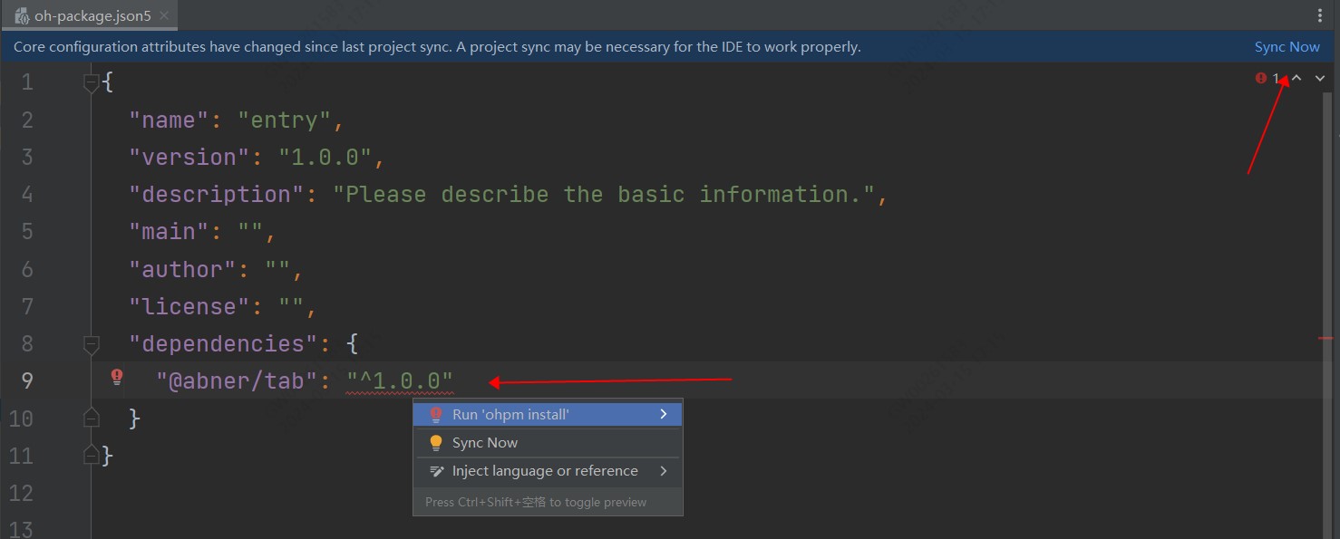
方式二:在工程的oh-package.json5中设置三方包依赖,配置示例如下:
```
"dependencies": { "@abner/tab": "^1.0.0"}
```
### 2、本地静态共享包har包使用
首先,下载har包,点击下载
下载之后,把har包复制项目中,目录自己创建,如下,我创建了一个libs目录,复制进去
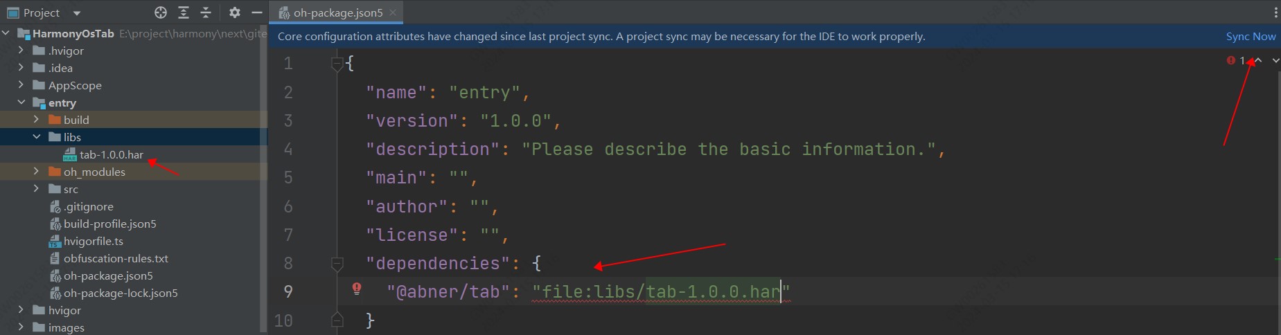
引入之后,进行同步项目,点击Sync Now即可,当然了你也可以,将鼠标放置在报错处会出现提示,在提示框中点击Run 'ohpm install'。
需要注意,@abner/tab,是用来区分目录的,可以自己定义,比如@aa/bb等,关于静态共享包的创建和使用,请查看如下我的介绍,这里就不过多介绍
[HarmonyOS开发:走进静态共享包的依赖与使用](https://juejin.cn/post/7274982412245876776)
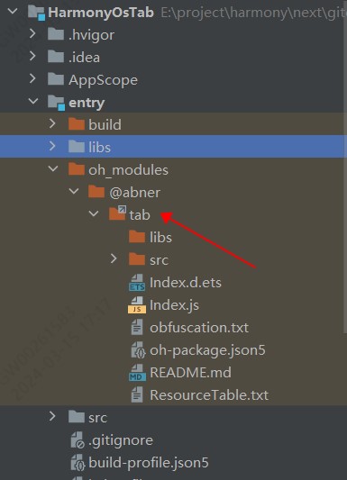
### 3、查看是否引用成功
无论使用哪种方式进行依赖,最终都会在使用的模块中,生成一个oh_modules文件,并创建源代码文件,有则成功,无则失败,如下:
## 基本使用
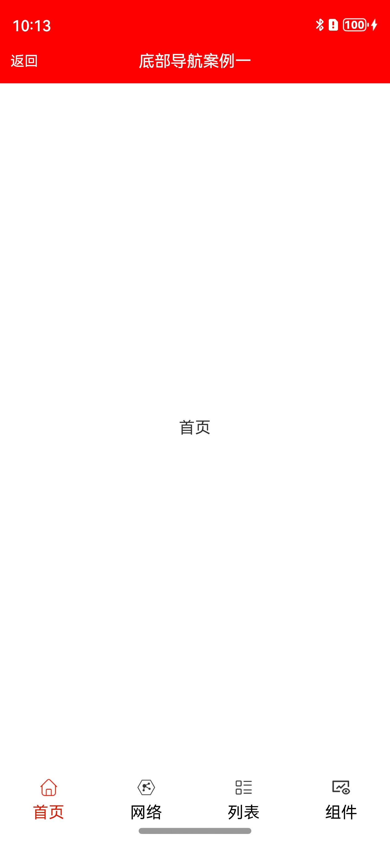
### 1、底部导航案例

```typescript
@Entry
@Component
struct BottomTabPage1 {
/**
* AUTHOR:AbnerMing
* INTRODUCE:tab对应的页面
* @param index 索引
* @param item TabBar对象,非必须
* */
@Builder
itemPage(index: number, item: TabBar) {
Text(item.title)
}
build() {
Column() {
ActionBar({ title: "底部导航案例一" })
BottomTabLayout({
itemPage: this.itemPage,//tab对应的页面
tabSelectedColor: "#D81E06",//文字未选择颜色
tabNormalColor: Color.Black,//文字未选择颜色
tabLabelMarginTop: 10,//文字距离图片的高度
tabScrollable: true,//是否可以滑动
tabMarginBottom: 30, //距离底部的距离,一般可以获取底部导航栏的高度,然后进行设置
onChangePage: (position) => {
//页面切换
},
onTabBarClick: (position) => {
//tab点击
},
tabBar: [
new TabBar("首页", $r("app.media.ic_home_select"), $r("app.media.ic_home_unselect")),
new TabBar("网络", $r("app.media.ic_net_select"), $r("app.media.ic_net_unselect")),
new TabBar("列表", $r("app.media.ic_list_select"), $r("app.media.ic_list_unselect")),
new TabBar("组件", $r("app.media.ic_view_select"), $r("app.media.ic_view_unselect"))
]
})
}.height("100%")
}
}
```
#### 相关属性
| 属性 | 类型 | 概述 |
|--------------------|-----------------------------|----------------|
| itemPage | BuilderParam | tab对应得页面 |
| tabSelectedColor | ResourceColor | tab选中颜色 |
| tabNormalColor | ResourceColor | tab未选中颜色 |
| tabSelectedBgColor | ResourceColor | 选中背景颜色 |
| tabNormalBgColor | ResourceColor | 未选中背景颜色 |
| tabIconWidth | number | 图片icon的宽度,默认20 |
| tabIconHeight | number | 图片icon的高度,默认20 |
| tabSize | number | tab文字大小 |
| tabWeight | number /FontWeight / string | 文字权重 |
| tabLabelMarginTop | number | 标签距离图片的高度 |
| tabBar | Array | tab数据源 |
| tabWidth | Length | tab指示器的宽度 |
| tabHeight | number | tab指示器的高度,默认56 |
| currentIndex | number | 当前索引,默认是第一个 |
| onChangePage | 回调方法 | 页面切换监听 |
| onTabBarClick | tab点击回调 | tab点击监听 |
| tabScrollable | boolean | 是否可滑动,默认不可以滑动 |
| tabMarginBottom | number | tab距离底部的距离 |
### 2、底部导航案例2,自定义Tab视图
```typescript
@Entry
@Component
struct BottomTabPage2 {
private currentIndex = 0 //默认是第一个
/**
* AUTHOR:AbnerMing
* INTRODUCE:tab对应的页面
* @param index 索引
* @param item TabBar对象,非必须
* */
@Builder
itemPage(index: number, item: TabBar) {
Text(item.title)
}
/**
* AUTHOR:AbnerMing
* INTRODUCE:自定义Tab视图,自己绘制
* @param index 索引
* @param item TabBar对象,非必须
* */
@Builder
itemTab(index: number, item: TabBar) {
Column() {
Image(this.currentIndex == index ? item.selectedIcon
: item.normalIcon)
.width(30).height(30)
Text(item.title)
.fontColor(this.currentIndex == index ? "#D81E06" : "#000000")
.fontSize(14)
.margin({ top: 5 })
}.width("100%")
}
build() {
Column() {
ActionBar({ title: "底部导航案例二" })
BaseBottomTabLayout({
itemPage: this.itemPage,
itemTab: this.itemTab,
tabBar: [
new TabBar("首页", $r("app.media.ic_home_select"), $r("app.media.ic_home_unselect")),
new TabBar("网络", $r("app.media.ic_net_select"), $r("app.media.ic_net_unselect")),
new TabBar("列表", $r("app.media.ic_list_select"), $r("app.media.ic_list_unselect")),
new TabBar("组件", $r("app.media.ic_view_select"), $r("app.media.ic_view_unselect"))
],
tabMarginBottom: 30, //距离底部的距离,一般可以获取底部导航栏的高度,然后进行设置
onTabBarClick: (position) => {
//tab点击
console.log("====点击了Tab" + position)
},
onChangePage: (position) => {
//页面切换
console.log("====页面切换了" + position)
}
})
}
}
}
```
#### 相关属性
| 属性 | 类型 | 概述 |
|--------------------|-----------------------------|------------------|
| itemPage | BuilderParam | tab对应得页面 |
| tabSelectedColor | ResourceColor | tab选中颜色 |
| tabNormalColor | ResourceColor | tab未选中颜色 |
| tabSelectedBgColor | ResourceColor | 选中背景颜色 |
| tabNormalBgColor | ResourceColor | 未选中背景颜色 |
| tabIconWidth | number | 图片icon的宽度,默认20 |
| tabIconHeight | number | 图片icon的高度,默认20 |
| tabSize | number | tab文字大小 |
| tabWeight | number /FontWeight / string | 文字权重 |
| tabLabelMarginTop | number | 标签距离图片的高度 |
| tabBar | Array | tab数据源 |
| tabWidth | Length | tab指示器的宽度 |
| tabHeight | number | tab指示器的高度,默认56 |
| currentIndex | number | 当前索引,默认是第一个 |
| onChangePage | 回调方法 | 页面切换监听 |
| onTabBarClick | tab点击回调 | tab点击监听 |
| tabScrollable | boolean | 是否可滑动,默认不可以滑动 |
| tabMarginBottom | number | tab距离底部的距离 |
| isMarginBottom | boolean | 默认开启,tab距离底部的距离 |
### 3、普通指示器导航

```typescript
@Entry
@Component
struct TabLayoutPage1 {
@Builder
itemPage(index: number, item: string) {
Text(item)
}
build() {
Column() {
ActionBar({ title: "封装导航【普通】" })
TabLayout({
tabBar: ["条目一", "条目二"],
itemPage: this.itemPage,
tabAttribute: (tab) => {
//设置属性
},
onChangePage: (position) => {
//页面改变
console.log("页面改变:" + position)
},
onTabBarClick: (position) => {
//点击改变
console.log("点击改变:" + position)
}
})
}
}
}
```
#### 相关属性
| 属性 | 类型 | 概述 |
|---------------------|------------------------------------------------|-------------------|
| tabWidth | Length | tab指示器的宽度 |
| tabHeight | number | tab指示器的高度 |
| onChangePage | 回调方法(position: number) | 页面改变回调 |
| currentIndex | number | 当前索引,默认第0个 |
| tabScrollable | boolean | 是否可以滑动切换页面,默认可以滑动 |
| tabBar | Array | 数据源 |
| itemPage | 回调方法BuilderParam (index: number, item: string) | tab对应得页面 |
| tabAttribute | 回调方法(attribute: TabModel) | 设置tab相关属性 |
| isHideDivider | boolean | 是否隐藏下划线,默认展示 |
| isTabAlignLeft | boolean | 是否从最左边开始,默认不是 |
| barMode | BarMode | 是均分还是可滑动,默认滑动 |
| onTabBarClick | 回调方法(position: number) | tab点击回调 |
| isShowTabMenu | boolean | 是否展示右边的按钮选项,默认不展示 |
| tabMenu | 回调方法BuilderParam | 右边展示的按钮视图 |
| tabMenuWidth | number | tab右侧按钮的宽度 |
| tabMenuMarginRight | number | tab按钮距离右侧的距离 |
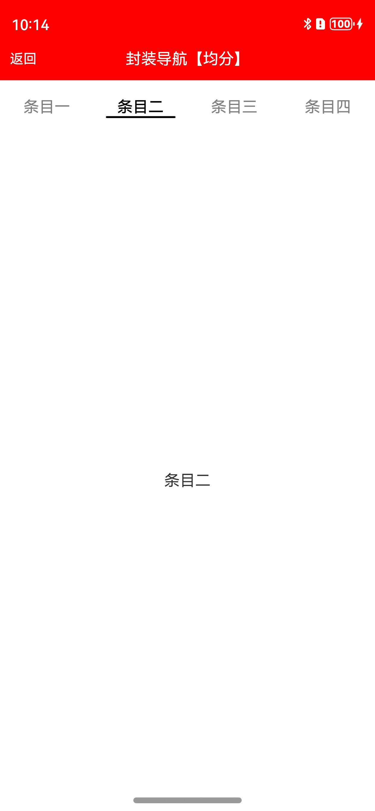
### 3、普通指示器导航【均分】

```typescript
@Entry
@Component
struct TabLayoutPage2 {
@Builder
itemPage(index: number, item: string) {
Text(item)
}
build() {
Column() {
ActionBar({ title: "封装导航【均分】" })
TabLayout({
tabBar: ["条目一", "条目二", "条目三", "条目四"],
barMode: BarMode.Fixed, //均分
itemPage: this.itemPage,
tabAttribute: (tab) => {
//设置属性
},
onChangePage: (position) => {
//页面改变
console.log("页面改变:" + position)
},
onTabBarClick: (position) => {
//点击改变
console.log("点击改变:" + position)
}
})
}
}
}
```
#### 相关属性
同上。
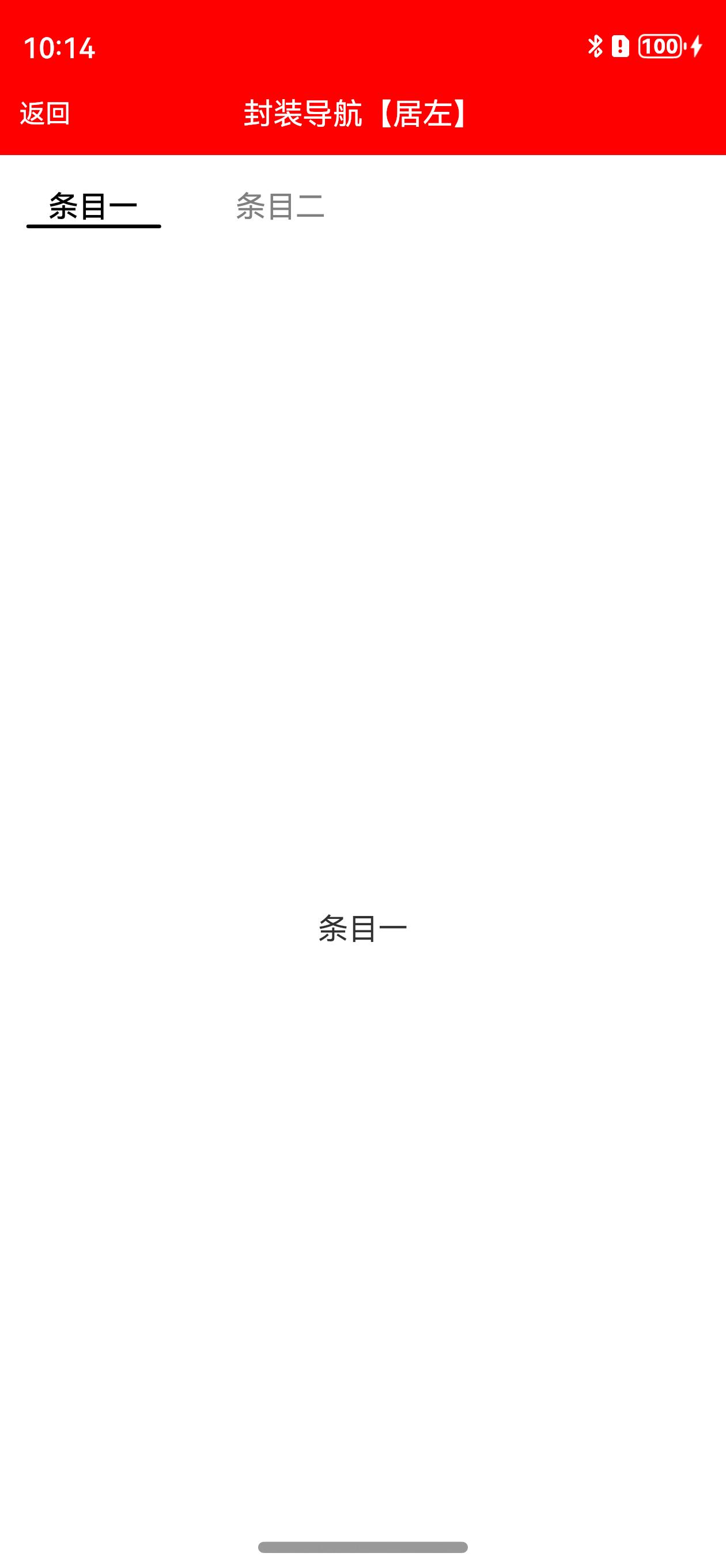
### 4、普通指示器导航【居左】

```typescript
@Entry
@Component
struct TabLayoutPage4 {
@Builder
itemPage(index: number, item: string) {
Text(item)
}
build() {
Column() {
ActionBar({ title: "封装导航【居左】" })
TabLayout({
tabBar: ["条目一", "条目二"],
isTabAlignLeft: true,
itemPage: this.itemPage,
tabAttribute: (tab) => {
//设置属性
},
onChangePage: (position) => {
//页面改变
console.log("页面改变:" + position)
}
})
}
}
}
```
#### 相关属性
同上。
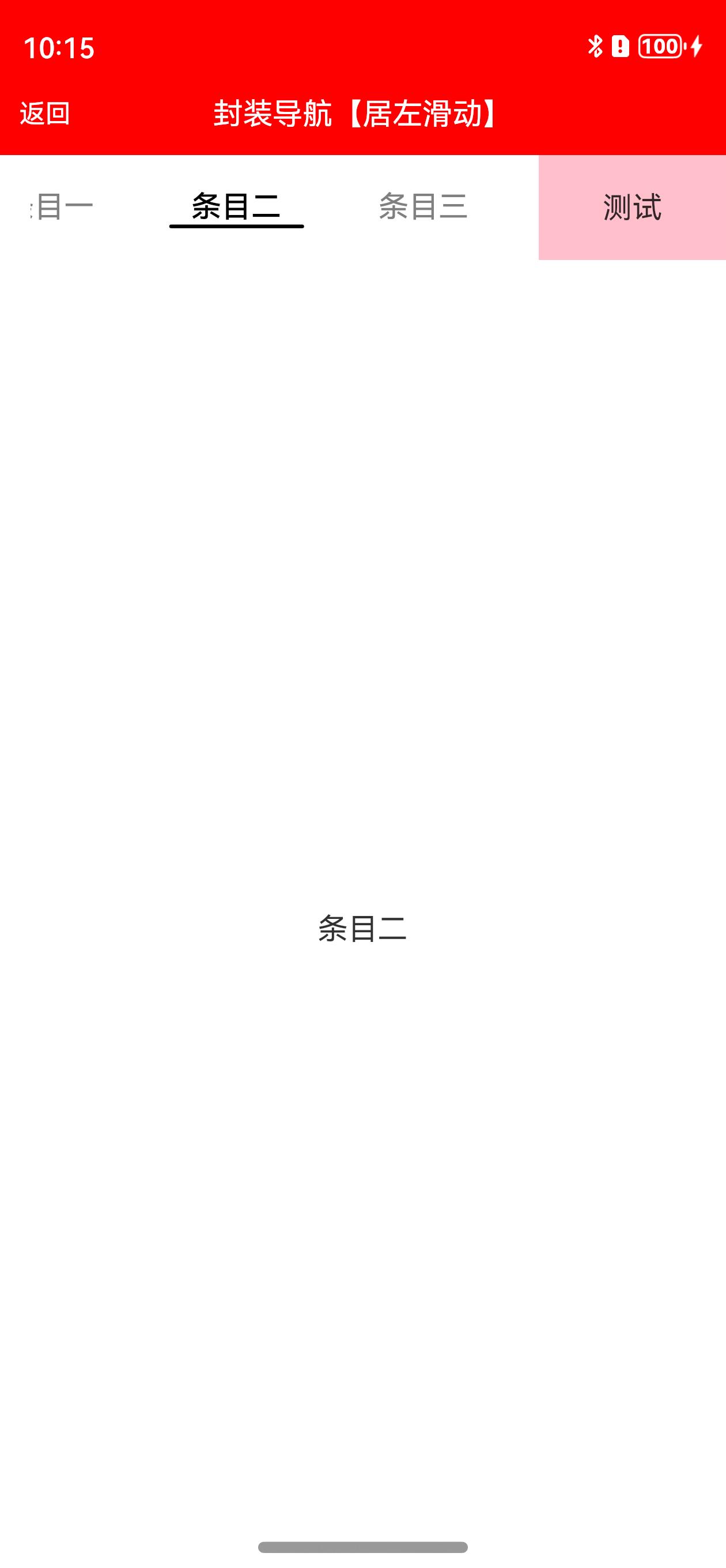
### 5、普通指示器导航【右边添加按钮】

```typescript
@Entry
@Component
struct TabLayoutPage6 {
@Builder
itemPage(index: number, item: string) {
Text(item)
}
/**
* AUTHOR:AbnerMing
* INTRODUCE:右侧的按钮,可以是任何的视图
* */
@Builder
itemMenu() {
Text("测试")
.backgroundColor(Color.Pink)
.width("100%")
.height("100%")
.textAlign(TextAlign.Center)
}
build() {
Column() {
ActionBar({ title: "封装导航【居左滑动】" })
TabLayout({
tabBar: ["条目一", "条目二", "条目三", "条目四", "条目五", "条目六"],
isTabAlignLeft: true,
itemPage: this.itemPage,
isShowTabMenu: true, //展示右侧的按钮
tabMenu: this.itemMenu, //按钮
tabMenuWidth: 100, //按钮宽度
tabAttribute: (tab) => {
//设置属性
},
onChangePage: (position) => {
//页面改变
console.log("页面改变:" + position)
}
})
}
}
}
```
#### 相关属性
同上。
## License
```
Copyright (C) AbnerMing, HarmonyOsTab Open Source Project
Licensed under the Apache License, Version 2.0 (the "License");
you may not use this file except in compliance with the License.
You may obtain a copy of the License at
http://www.apache.org/licenses/LICENSE-2.0
Unless required by applicable law or agreed to in writing, software
distributed under the License is distributed on an "AS IS" BASIS,
WITHOUT WARRANTIES OR CONDITIONS OF ANY KIND, either express or implied.
See the License for the specific language governing permissions and
limitations under the License.
```