# ACProgressLite
**Repository Path**: fzyme_admin/ACProgressLite
## Basic Information
- **Project Name**: ACProgressLite
- **Description**: No description available
- **Primary Language**: Unknown
- **License**: MIT
- **Default Branch**: master
- **Homepage**: None
- **GVP Project**: No
## Statistics
- **Stars**: 0
- **Forks**: 0
- **Created**: 2021-04-20
- **Last Updated**: 2021-04-20
## Categories & Tags
**Categories**: Uncategorized
**Tags**: None
## README
# ACProgressLite
[](https://travis-ci.org/Cloudist/ACProgressLite)
English Version / [中文版本](https://github.com/Cloudist/ACProgressLite/blob/master/README-CHN.md)
An Android loading widget library. Lite and easy to use, strong customizability. Can be used to implement 'iOS' like loading dialog efficiently.
Similar to iOS [MBProgressHUD](https://github.com/jdg/MBProgressHUD)
**Keywords** *Progressbar, Progresswheel, HUD, Android, Loading*
**Minimum SDK Version:** API 9 ( Android 2.3 )
[Sample APK download](https://raw.githubusercontent.com/Cloudist/ACProgressLite/master/intros/sample.apk)
## Current Version
* 1.2.1
## Usage
* gradle: `compile 'cc.cloudist.acplibrary:library:1.2.1'`
## Sample Code
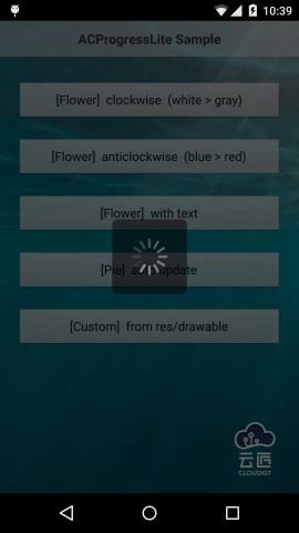
* Flower
```
ACProgressFlower dialog = new ACProgressFlower.Builder(this)
.direction(ACProgressConstant.DIRECT_CLOCKWISE)
.themeColor(Color.WHITE)
.text("Title is here")
.fadeColor(Color.DKGRAY).build();
dialog.show();
```
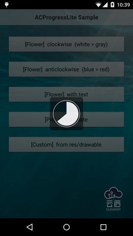
* Pie
```
ACProgressPie dialog = new ACProgressPie.Builder(this)
.ringColor(Color.WHITE)
.pieColor(Color.WHITE)
.updateType(ACProgressConstant.PIE_AUTO_UPDATE)
.build();
dialog.show();
```
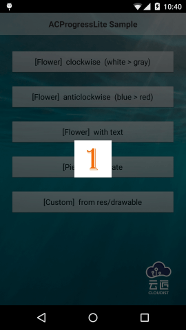
* Custom
```
ACProgressCustom dialog = new ACProgressCustom.Builder(this)
.useImages(R.drawable.p0, R.drawable.p1, R.drawable.p2, R.drawable.p3)
.build();
dialog.show();
```
## Configuration
3 types of dialog are avaliable now:
Here are some general configurations:
1. `sizeRatio` size of the background. The value is float and less than 1f. It means the ratio of "real size / the smaller edge length of the screen". aka:
background length = the smaller edge length of the screen * sizeRatio
> Pay attention to the situation of "Flower type with text", it will be explained int next scetion.
1. `bgColor` Color of background, int value.
1. `bgAlpha` Transparency of background. 0 is full transparency, 1 is opaque. All alpha configurations are similar.
1. `bgCornerRadius` Radius of four corners of the background.
*bgColor, bgAlpha, bgCornerRadius are not available for custom type*
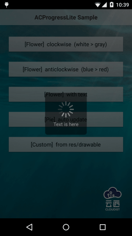
* **Flower**
Most commonly used type. Support adding text title.
**Configuration**|**Description**
:------|:------------------
themeColor|Start color of petals.
borderPadding|Distance between outer edge of petals and edge of background / length of the edge of background. (length of the edge of background is based on sizeRatio)
centerPadding|Distance between inner edge of petals and center of background / length of the edge of background. (length of the edge of background is based on sizeRatio)
fadeColor|End color of petals.
petalCount|Number of petals.
petalAlpha|Transparency of petals.
petalThickness|Thickness of petals.
direction|Direction of petals' rotation, `ACProgressConstant.DIRECT_CLOCKWISE` or `DIRECT_ANTI_CLOCKWISE`.
speed|Speed of petals' rotation, frames count in each second.
text|Text, shown under petals.
textSize|Text's size.
textColor|Text's color.
textAlpha|Text's transparency.
textMarginTop|Distance between text and petals.
isTextExpandWidth|Whether expand the background width to equal the height when a text title is set. If you set a text title, the background's height will become longer because of making room for text. If this value is `true`, the petals are still drawn by sizeRatio, but petals will be horizontally centered as the background's width is expanded to equal the height; if this value is `false`, the background will be rectangle with different width and height.
* **Pie**
Suitable for display progress. Manual-update and auto-update are supported.
**Configuration**|**Description**
:------|:------------------
ringColor|Color of ring.
ringAlpha|Transparency of ring.
ringThickness|Thickness of ring.
ringBorderPadding|Distance between ring and edge of background / length of the edge of background.
pieColor|Color of pie.
pieAlpha|Transparency of pie.
pieRingDistance|Distance between ring and pie / length of the edge of background.
updateType|Update type. `PIE_AUTO_UPDATE` or `PIE_MANUAL_UPDATE`. Manually update with method `setPiePercentage()`.
speed|frames count in each second with auto-update type.
pieces|pieces of pie with auto-update type.
* **Custom**
like GIF, support res/drawable resources ids array or image files array as data source.
**Configuration**|**Description**
:------|:------------------
useImages|resources ids array.
useFiles|image files array.
speed|frames count in each second.
## Notice
* Try to **clean** the project first when you come across any problem.
* use `setCanceledOnTouchOutside(true)` in version 1.2.0+ when you want to dismiss the dialog when touch outside.
* Most of the methods in `Dialog` are supported.
* We strongly suggest you to use version above 1.2.0
* If you use version before 1.1.0 (without 1.1.0),and gradle error occured, you can add `tools:ignore="label` under tag `application` in Manifest to solve it.
* Don not try to use `useImages` and `useFiles` at the same time, or only the last calling is avaliable.
* **Default configuration can perform well under most situations. If you really want to do customization, please tweak carefully to get best visual performance.**
* I'm not a native English speaker, there may be some grammar mistakes in this file. Suggestions and corrections are welcome.
## License
* [MIT License](http://mit-license.org/)