# charts-demo
**Repository Path**: mirrors_mongodb/charts-demo
## Basic Information
- **Project Name**: charts-demo
- **Description**: For the .local events in general, and for .local SF specifically
- **Primary Language**: Unknown
- **License**: Not specified
- **Default Branch**: master
- **Homepage**: None
- **GVP Project**: No
## Statistics
- **Stars**: 0
- **Forks**: 0
- **Created**: 2020-08-09
- **Last Updated**: 2025-06-11
## Categories & Tags
**Categories**: Uncategorized
**Tags**: None
## README
# MongoDB Charts
## Setup the Datasets
Download the [airbnb dataset](https://webassets.mongodb.com/_com_assets/cms/airbnb-sf-5uzx3cjqff.zip), unzip it, and import it into your MongoDB Atlas
cluster. Have a look at the [command line tools](https://docs.atlas.mongodb.com/command-line-tools/)
for directions on how to use `mongoimport` with MongoDB Atlas. The included
dataset is sized to be able to fit into a free M0 cluster on MongoDB Atlas.
## Analysing Airbnb Data
### Add a Data Source
1. With a dataset in place, you'll want to enable Charts for your project.
2. Select the _Charts_ link on the left-hand side, then select the
_Activate MongoDB Charts_ button.
3. Add a new data source to your project, choose the Cluster, database and
collection. For this example, I'll use the `sanFranciscoListingsAndReviews`
collection. Then I'll accept the default permissions.
### Create a Dashboard
1. Go to the *Dashboards* tab
2. Click *New Dashboard*
3. Enter a name and description
### Add Some Charts
Inside the MongoDB Charts dashboard, you'll now add a chart to the dashboard.
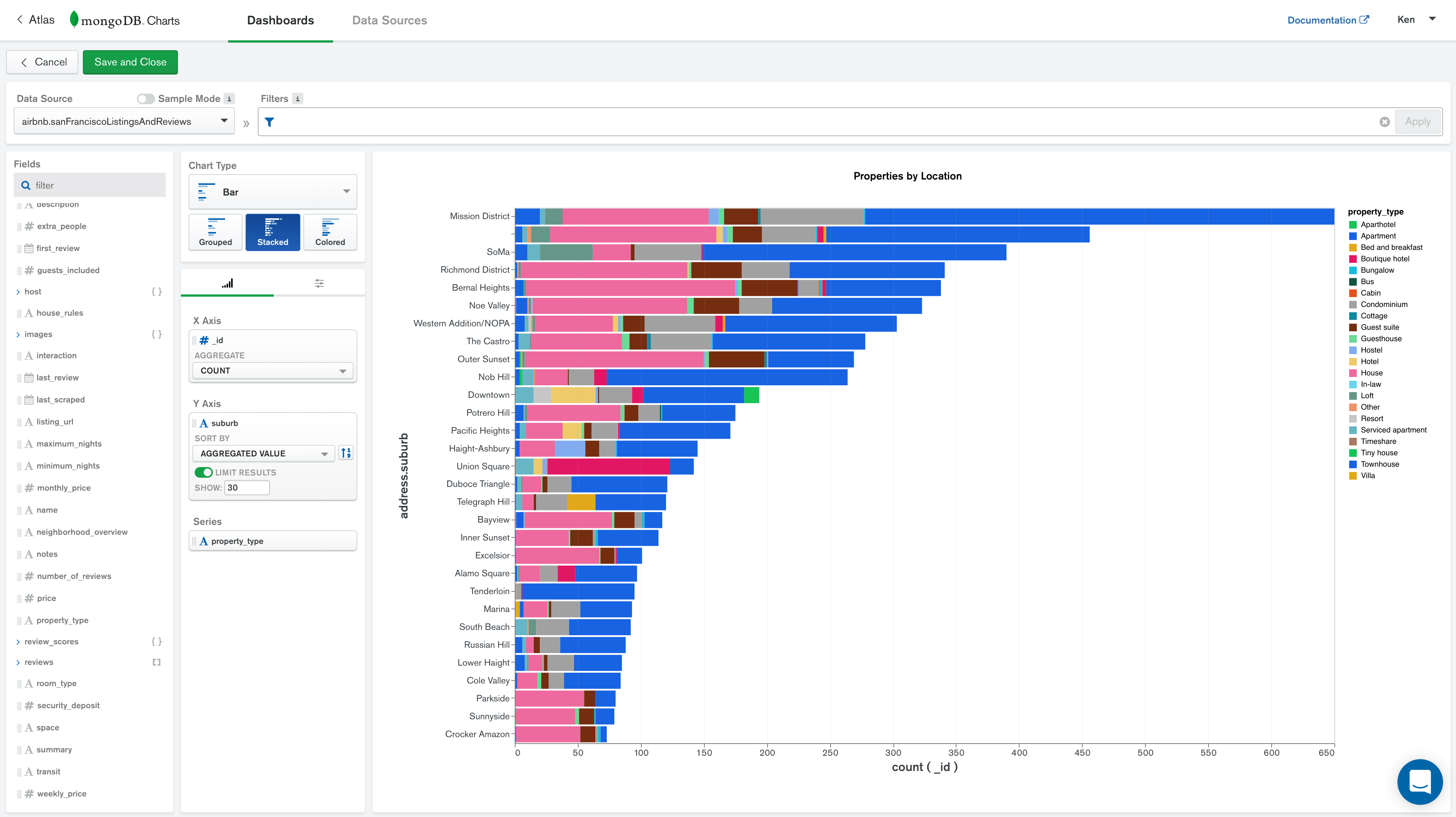
#### Multi-Series Stacked Bar Chart
Let's locate the neighborhoods in San Francisco that have the most Airbnb
properties and split them out by property type.
1. Select the San Francisco Airbnb (`airbnb.sanFranciscoListingsAndReviews`) dataset as the datasource.
2. For the _Chart Type_ select *Bar/Stacked*.
3. Use the following in the _Encoding_ sections for the chart data:
* X Axis: `_id`, Count aggregation
* Y Axis: `address.suburb`
* Sort By: Aggregated Value, Descending
* Limit: 30
* Series: `property_type`
4. Add a name to the chart, like _Properties by Location_
Your chart should look something like:
 ---
Show the areas with the most expensive properties, and correlate with the review scores.
Data Source: Select the San Francisco Airbnb (`airbnb.sanFranciscoListingsAndReviews`) dataset as the datasource.
Chart Title: _Price by Location, Colored by Location Review Score_
Chart Type: Bar / Colored
Encodings:
+ X Axis: `price`, Mean aggregation
+ Y Axis: `address.suburb`
+ Sort By: Aggregated Value, Descending
+ Limit: 30
+ Color: `review_scores.review_scores_location`, Mean aggregation
Your chart should look something like:
---
Show the areas with the most expensive properties, and correlate with the review scores.
Data Source: Select the San Francisco Airbnb (`airbnb.sanFranciscoListingsAndReviews`) dataset as the datasource.
Chart Title: _Price by Location, Colored by Location Review Score_
Chart Type: Bar / Colored
Encodings:
+ X Axis: `price`, Mean aggregation
+ Y Axis: `address.suburb`
+ Sort By: Aggregated Value, Descending
+ Limit: 30
+ Color: `review_scores.review_scores_location`, Mean aggregation
Your chart should look something like:
-ulbmzx8f30.png) ---
Show the number of properties with various review scores
Data Source: Select the San Francisco Airbnb (`airbnb.sanFranciscoListingsAndReviews`) dataset as the datasource.
Chart Title: _Review Score Histogram_
Chart Type: Column / Grouped
Encodings:
+ X Axis: `review_scores.review_scores_rating`
+ Binning: On, bin size 5
+ Y Axis: `_id`, Count aggregation
+ Filter (to hide properties with no review score):
+ ` { 'review_scores.review_score_rating': { $gte: 0 }}`
Your chart should look something like:
---
Show the number of properties with various review scores
Data Source: Select the San Francisco Airbnb (`airbnb.sanFranciscoListingsAndReviews`) dataset as the datasource.
Chart Title: _Review Score Histogram_
Chart Type: Column / Grouped
Encodings:
+ X Axis: `review_scores.review_scores_rating`
+ Binning: On, bin size 5
+ Y Axis: `_id`, Count aggregation
+ Filter (to hide properties with no review score):
+ ` { 'review_scores.review_score_rating': { $gte: 0 }}`
Your chart should look something like:
-q8780dz7ru.png) ---
Show the types of properties that contain pools.
Data Source: Select the San Francisco Airbnb (`airbnb.sanFranciscoListingsAndReviews`) dataset as the datasource.
Chart Title: _Properties with Pools_
Chart Type: Circular / Donut
Encodings:
+ Label: `property_type`
+ Arc: `_id`, Count aggregation
+ Filter (to show only properties with pools):
+ ` { amenities: 'Pool' }`
Your chart should look something like:
---
Show the types of properties that contain pools.
Data Source: Select the San Francisco Airbnb (`airbnb.sanFranciscoListingsAndReviews`) dataset as the datasource.
Chart Title: _Properties with Pools_
Chart Type: Circular / Donut
Encodings:
+ Label: `property_type`
+ Arc: `_id`, Count aggregation
+ Filter (to show only properties with pools):
+ ` { amenities: 'Pool' }`
Your chart should look something like:
-njzr0e5yta.png) ---
Show the number of reviews of any property, month by month
Data Source: Select the San Francisco Airbnb (`airbnb.sanFranciscoListingsAndReviews`) dataset as the datasource.
Chart Title: _Reviews Over Time_
Chart Type: Area / Discrete
Encodings:
+ X Axis: `reviews.date`
+ Array Reduction: Unwind Array
+ Binning: On, bin by month
+ Y Axis: `_id`, Count aggregation
Your chart should look something like:
---
Show the number of reviews of any property, month by month
Data Source: Select the San Francisco Airbnb (`airbnb.sanFranciscoListingsAndReviews`) dataset as the datasource.
Chart Title: _Reviews Over Time_
Chart Type: Area / Discrete
Encodings:
+ X Axis: `reviews.date`
+ Array Reduction: Unwind Array
+ Binning: On, bin by month
+ Y Axis: `_id`, Count aggregation
Your chart should look something like:
-5qzotqym2i.png) ---
Show the number of properties with and without pools by area
Data Source: Select the San Francisco Airbnb (`airbnb.sanFranciscoListingsAndReviews`) dataset as the datasource.
Chart Title: _Pool or No Pool_
Chart Type: Column / Stacked
Encodings:
+ X Axis: `address.suburb`
+ Y Axis: `_id`, Count aggregation
+ Series: `amenities`
+ Array Reduction: Existence of value: "Pool"
Your chart should look something like:
---
Show the number of properties with and without pools by area
Data Source: Select the San Francisco Airbnb (`airbnb.sanFranciscoListingsAndReviews`) dataset as the datasource.
Chart Title: _Pool or No Pool_
Chart Type: Column / Stacked
Encodings:
+ X Axis: `address.suburb`
+ Y Axis: `_id`, Count aggregation
+ Series: `amenities`
+ Array Reduction: Existence of value: "Pool"
Your chart should look something like:
-ijnwj9qvka.png)