# vue-spring-bottom-sheet
**Repository Path**: mirrors_wickedest/vue-spring-bottom-sheet
## Basic Information
- **Project Name**: vue-spring-bottom-sheet
- **Description**: 😎 Modern and 🚀 Performant Bottom Sheet for Vue.js
- **Primary Language**: Unknown
- **License**: MIT
- **Default Branch**: master
- **Homepage**: None
- **GVP Project**: No
## Statistics
- **Stars**: 0
- **Forks**: 0
- **Created**: 2025-02-16
- **Last Updated**: 2025-12-06
## Categories & Tags
**Categories**: Uncategorized
**Tags**: None
## README
# Vue Spring Bottom Sheet
**vue-spring-bottom-sheet** is built on top of **[@vueuse/gesture]** and **[@vueuse/motion]**.
😎 **Modern** and 🚀 **Performant** Bottom Sheet for Vue.js
[Demo](https://vue-spring-bottom-sheet.douxcode.com/) 👀
| 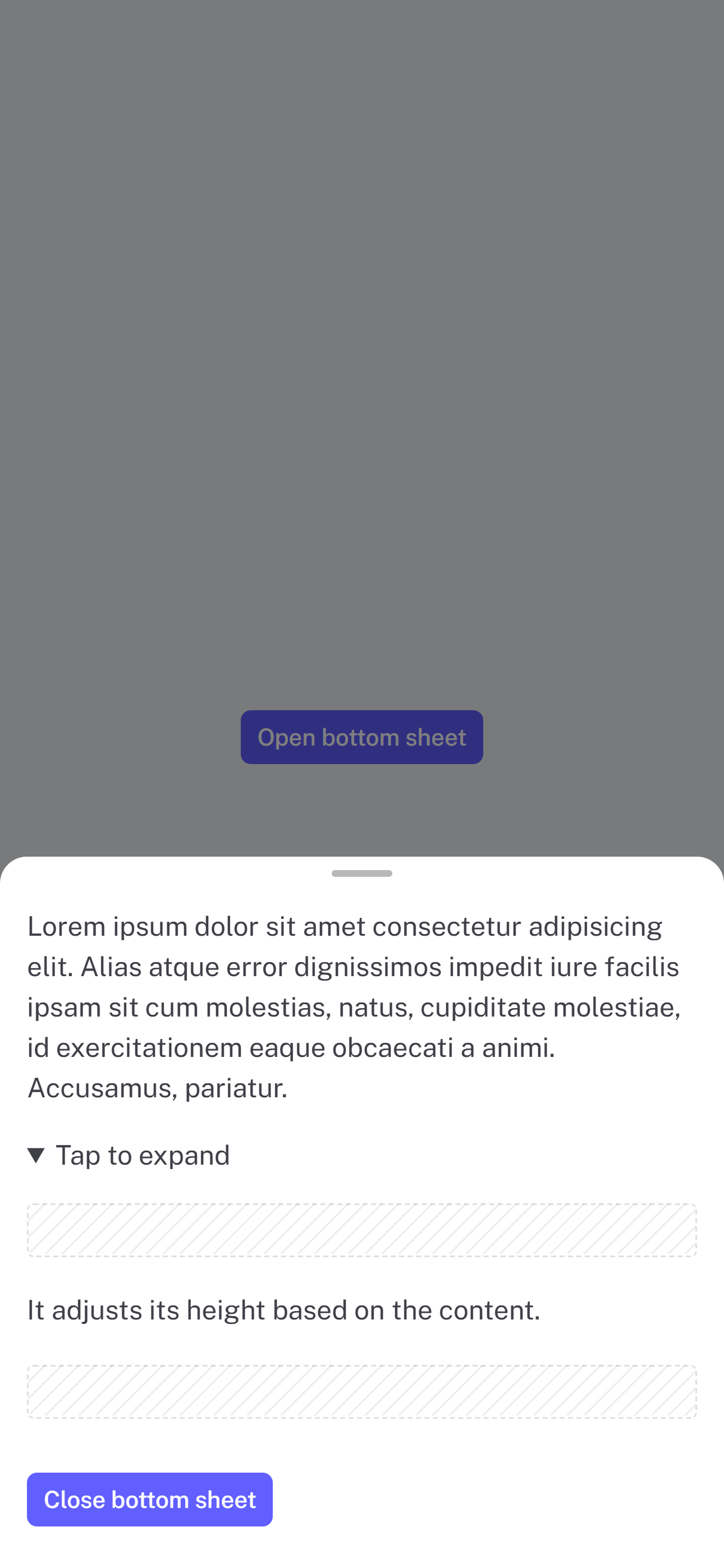 | 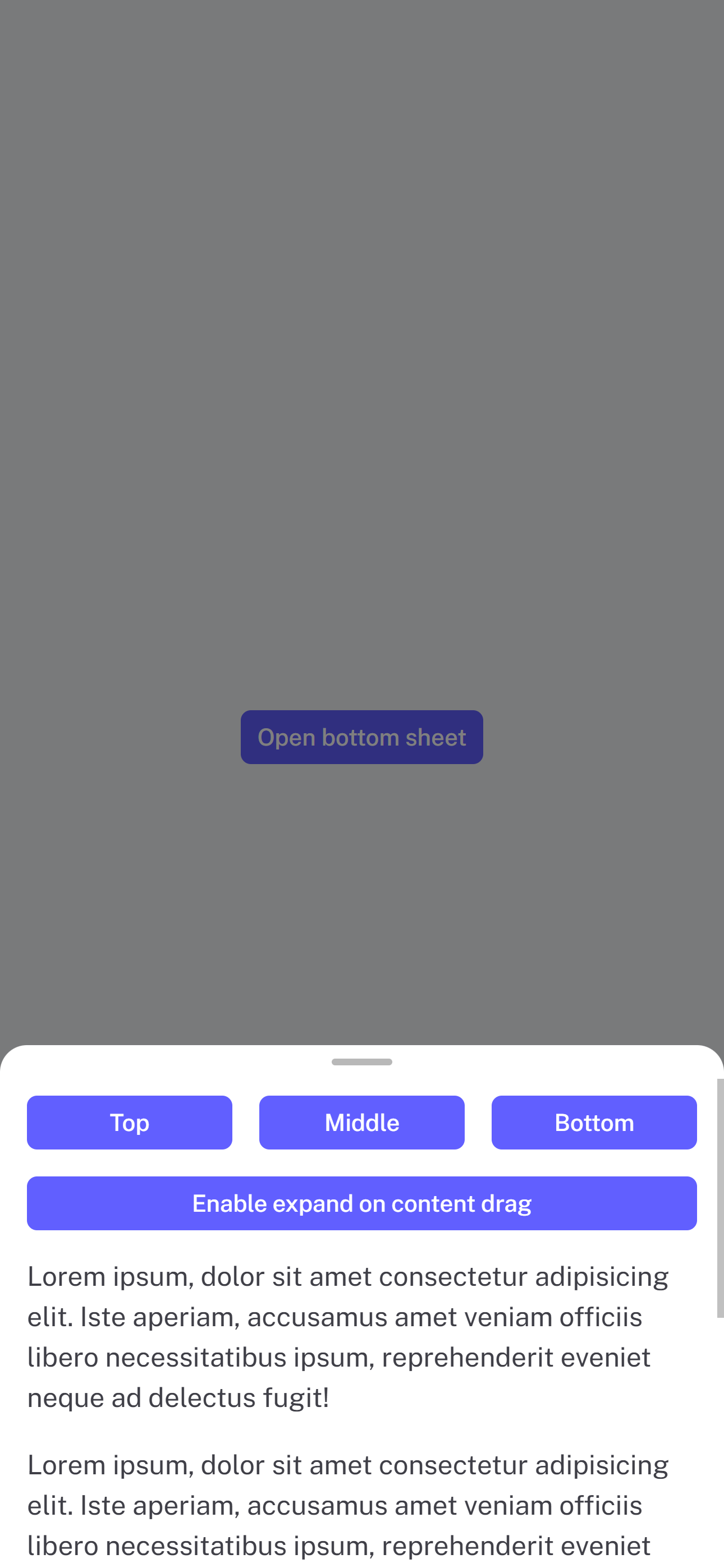 | 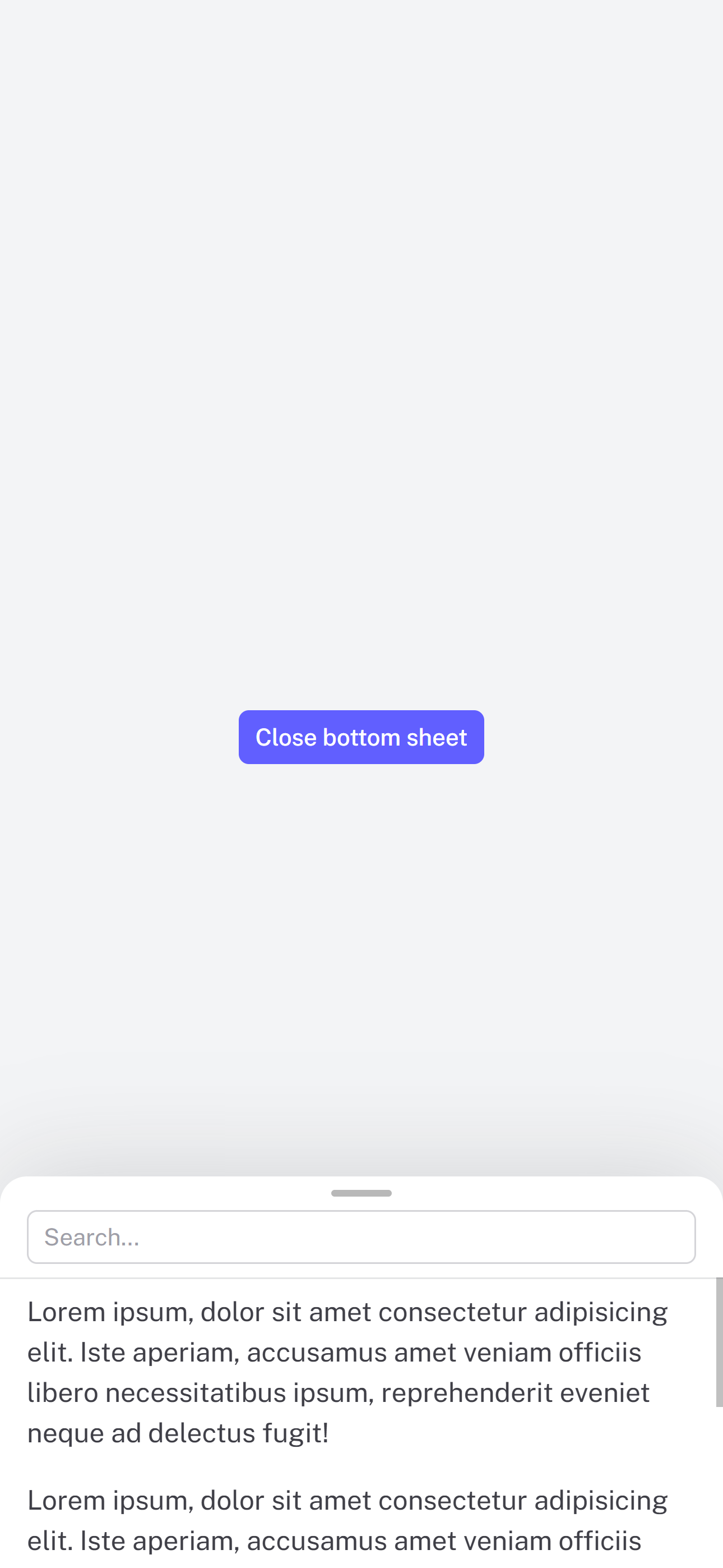 | 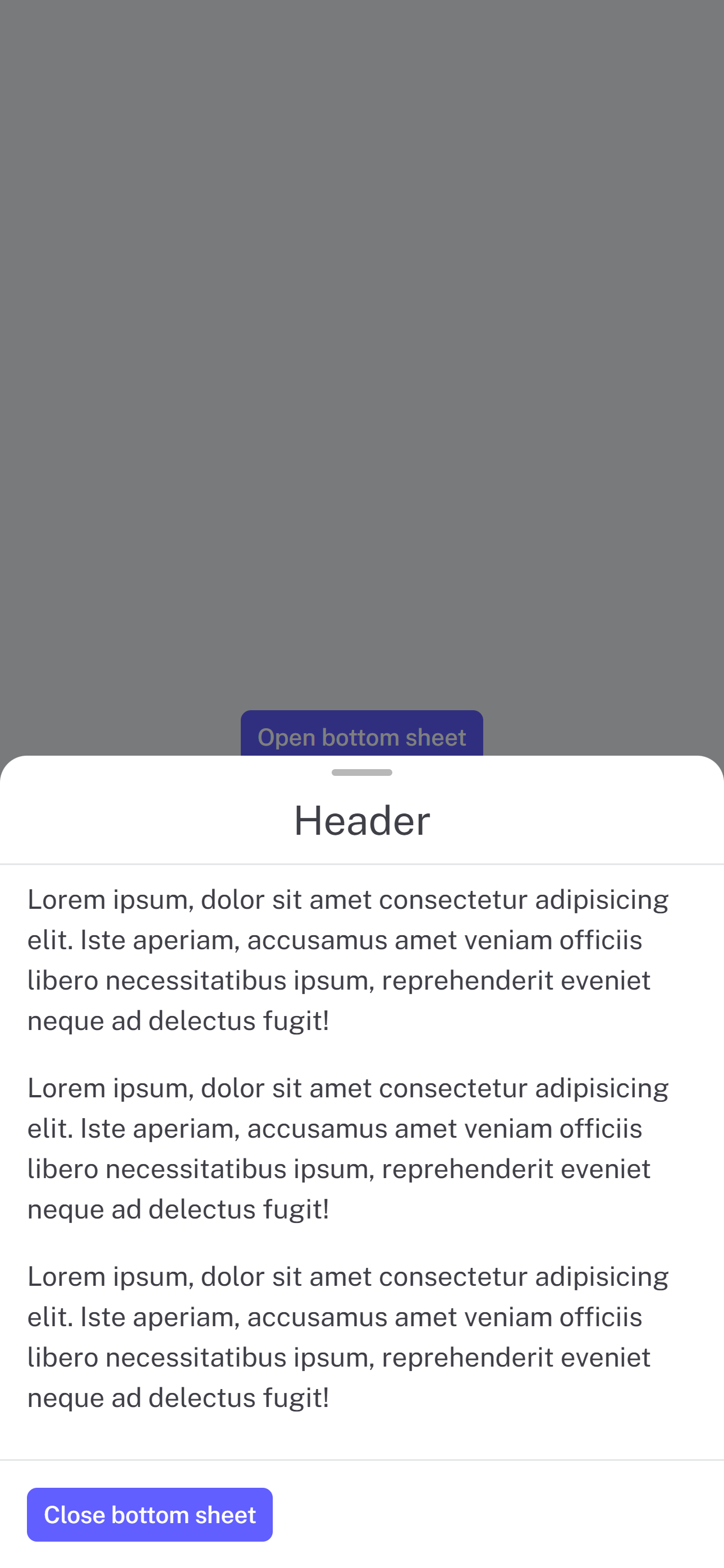 |
| :-----------------------------------------------------------------: | :----------------------------------------------------------------: | :--------------------------------------------------------------------: | :------------------------------------------------------------------: |
# Installation
```
npm install @douxcode/vue-spring-bottom-sheet
```
```
bun install @douxcode/vue-spring-bottom-sheet
```
# Getting started
## Basic usage
```vue
Your awesome content
```
## Basic usage `setup` + TS
```vue
Your content
```
## Usage in Nuxt 3
For Nuxt 3, just wrap component in ``
```vue
Your awesome content
```
## Slots
```vue
Header
Your content
Footer
```
## CSS Custom Properties
```css
--vsbs-backdrop-bg: rgba(0, 0, 0, 0.5);
--vsbs-shadow-color: rgba(89, 89, 89, 0.2);
--vsbs-background: #fff;
--vsbs-border-radius: 16px;
--vsbs-max-width: 640px;
--vsbs-border-color: rgba(46, 59, 66, 0.125);
--vsbs-padding-x: 16px;
--vsbs-handle-background: rgba(0, 0, 0, 0.28);
```
## Props
### Prop Definitions
| Prop | Type | Description | Example |
| ------------------- | -------- | --------------------------------------------------------------------------------------------------- | -------------------------------- |
| duration | Number | Defines the duration open and close animations. | `:duration="250"` |
| snapPoints | Number[] | Defines custom snapping positions for the bottom sheet | `:snapPoints="[300, 600, 900]"` |
| defaultSnapPoint | Number | Specifies the default snap point. Note that at least one snapPoint must be specified for it to work | `:default-snap-point="600"` |
| blocking | Boolean | Controls whether the bottom sheet blocks interactions with underlying content | `:blocking="true"` |
| canSwipeClose | Boolean | Enables or disables swipe gestures for closing the sheet | `:can-swipe-close="true"` |
| canOverlayClose | Boolean | Allows tapping the overlay to close the sheet | `:can-overlay-close="true"` |
| expandOnContentDrag | Boolean | Enables expanding the sheet by dragging its content | `:expand-on-content-drag="true"` |
### Default Values
| Prop | Default |
| ------------------- | -------------------------- |
| duration | `250` |
| snapPoints | `minHeight` |
| defaultSnapPoint | `minHeight / minSnapPoint` |
| blocking | `true` |
| canSwipeClose | `true` |
| canOverlayClose | `true` |
| expandOnContentDrag | `true` |
## Exposed methods
Assuming there is `const bottomSheet = ref()`
| Method | Description | Example |
| ----------- | ------------------------------------ | ------------------------------------ |
| snapToPoint | Snaps the sheet to a specified point | `bottomSheet.value.snapToPoint(300)` |
| open | Opens the bottom sheet | `bottomSheet.value.open()` |
| close | Closes the bottom sheet | `bottomSheet.value.close()` |
## Events
| Event | Description | Example |
| ------------- | --------------------------------------------------------------------------------------------------------------------------------------------- | --------------------------- |
| min-height | Fires when the minimum height of the sheet changes. Passes the value as an argument. | `@min-height="(n) => {}"` |
| max-height | Fires when the height of the window changes. Passes the value as an argument. Note that this value is throttled to prevent excessive updates. | `@max-height="(n) => {}"` |
| dragging-up | Fires when the bottom sheet is being dragged up | `@dragging-up="() => {}"` |
| dragging-down | Fires when the bottom sheet is being dragged down | `@dragging-down="() => {}"` |
| opened | Fires when the bottom sheet is opened | `@opened="() => {}"` |
| closed | Fires when the bottom sheet is closed | `@closed="() => {}"` |
## Acknowledgments
This project was inspired by the following:
- [react-spring-bottom-sheet]: Accessible ♿️, Delightful ✨, & Fast 🚀
- [@webzlodimir/vue-bottom-sheet]: 🔥 A nice clean and touch-friendly bottom sheet component based on Vue.js and Hammer.js for Vue 3
[@vueuse/gesture]: https://gesture.vueuse.org/
[@vueuse/motion]: https://motion.vueuse.org/
[react-spring-bottom-sheet]: https://react-spring.bottom-sheet.dev/
[@webzlodimir/vue-bottom-sheet]: https://github.com/vaban-ru/vue-bottom-sheet